Powered By Blogger

Thursday, December 10, 2015

Simulation Game Dev Blog #3

     This blog post will be kinda short due to the fact that, well, there was not much left to do for Vending Machine Simulator 2015. So lemme get started so we can get oust of here quick.

     So for this final iteration I was tasked with adding all the different names and types of snacks either machine provided. I also set the prices for each snack as well. So the first thing I did was take our existing UI, which only had the codes in the "Snack List". Whilst adding the names I realized that the amount of combinations on the key pad could far exceed the amount of snacks available. Thank you so much original model for being so unnecessary! So I did more work than I needed to, great. Luckily the way Garret set it up the widget was that we could just choose what combinations worked and which ones were invalid. Alright, so I made the the names for the candies and chips and then put down their codes and the price of each. I made the vending machine prices from like the 90's (as my instructor observed) with chips costing $.50 and candy costing .75. I originally made the chips $.65, but Garret set up the returning of money only utilizing quarters, so we worked the prices to use multiples of 25 due to sake of time. The last thing I did for the Snack Machine was set the correct models of either candy or chips to spawn out when purchased. The current UI is below along with the changes in the widget as well.


     Now for the Soda Machine. I originally just put,"All Sodas Cost $1". For some reason though the part that said "All Sodas" was not visible, but said it was in the UML editor. I must have left it because it seems that Garret just listed the Soda and each cost $1. As you can tell I also made the Sodas cost $1 in the widget blueprints. I guess that's it. Oh and of course I rigorously tested out my older UI stuff to see if it was all good and it was except for not returning the money fully, but we fixed that with the price change. Images for that are below.


One last thing, we also completed our presentation  I felt like it went very well. I don't know if we are going to any more to it, but we made a great simulation. The one regret I have is feeling like I didn't do enough. I mean Garret did so much more than the other three of us. Maybe he just had a lot of fun with it. I think for any next project I do with a group I should really be on the members asking if there is anything I can do and if I'm doing enough. Well that's it for these dev blogs for a while. I'm outtie fivethougtee.

Thursday, December 3, 2015

Simulation Game Dev Blog #2

     This is the second dev blog for my class Group Project for Vending Machine Simulator. This iteration, I was tasked with taking my UI mockups and turning them into the actual UI for the Simulation. Here is my step by step of my development of the UI.

     So to start I took a more detailed look at what the actual vending machine inputs looked like. I noticed right away that the mockups I made were not very accurate, so it was time redesign them. Then I figured, why redesign the mockup If I were to just make each button individually anyway? Oh, before I continue, let me flash back to last Thursday. My group and I just made the UI placeholder, and we were just messing around with it. We noticed that the default buttons were only square shaped. After trying for awhile to create circular ones in UE4, the instructor gave us the suggestion to make a material with a circle shape and put that in place of the default one. We attempted to do so even with his help, but no luck getting it in. Let this be a lesion, don’t use material for the UML, use textures, because it worked perfectly after we assigned the PNG as a texture to the buttons. With that, I had to design more realistic buttons.  Now back to modern day! I went back to viewing the snack machine model, but I needed to get the colors into the Photoshop pallet to make them appear more accurate. I remembered that I had the texture image I could use to get the colors. After getting the right color, I made a circle, filled it with the color, and I added a gradient to make it look more 3D. After I made the button, I imported it into UE4, but I realized, I did not have a texture for when the button is pressed down. So I just tinted it in idle, and when it is clicked, it goes a bit lighter has if going closer to inside of the panel. Those were the buttons for the letters and then I made the buttons for the numbers. I just took the same shape and just made it white with a gradient. I imported them all in and added the corresponding numbers/letters to the buttons. The font for those were just UE4 default. Speaking of Fonts, I made sure to use a digital font type, colored red, to get the look just right. The font I used is called Digital 7 and I actually used it for a previous simulation. Also the backgrounds for the digital displays were black, of course. Also the other buttons and displays may have no alterations, but that was for the inputs that would not exist in real life. For the soda machine buttons, I just took logos from real sodas and made PNGs in Photoshop. I also used the same tint method to make the buttons look like they really clicked. After buttons for both machines were made and the other displays were set. It was time to make the slots/button for the money.

     I decided to create the “Return Change Button” first because I was already on the mindset of making buttons. What I did was I took a vending machine with a much better resolution as a reference to create this button. I used the same size of the earlier buttons and cut out the middle to then use Bevel and Emboss to create the area the button is set inside. I then took a smaller circle and also used Bevel and Emboss to make the button have a 3D effect. I knew that using tint would not work well so I made the actual button smaller as when pressed the button would move away from the player ever so slightly. I did however use the tint when the button was hovered over. Next it was time to make the Coin Slot. What I did was take the same old circle shape and Bevel and Embossed it and cut out a horizontal slot in middle. I also used the tint when hovered over and for the click action, I then an image of a coin and stuck it half way in. Next thing up was the Collect Change slot. This time I needed it to be square, so I made the it up and much like the Change Button; I cut out the middle a Beveled and Embossed it. I then took the cut out portion, colored it a bit light and also Beveled it. For the mouse hover action, I made the slot appear open with a coin inside and when clicked on, the coin goes away and the slot is still open until hovered off. Unfortunately, when there is no money to collect the coin still shows, I need to find a way to remedy that. Last thing left to do was create the Dollar Insert slot. Just a note, I used the same vending machine to reference the money slots and used them for both machines. So for the dollar slot, I literally took the same one I created for the mockup because it looked so good. I just used the real ref image to make it have the correct colors, 3D effect, and other small details. For the mouse actions, the hover just tints it and the click shows a dollar in the slot. Same with the coin showing up in the change slot with no money, the same happens with the bills, so that also needs to be fixed as well. There was a problem I ran into after importing the Dollar Slot images. When it was clicked on, the whole image with the Bill in contracted. So all I needed to do was make all the images the same size, it worked fine.


     Well that is my development iteration for my Vending Machine Simulator group project. The final  products are below. Also, there was no coding since the placeholders were made to be coded with and I just change the look of them.


Sunday, November 15, 2015

Simulation Game Dev Blog #1

     So in my Simulation/Serous Game Development class we were put into groups to develop a small simulation of some sort. My group chose to create a vending machine simulator that has both a snack and soda machine. Just this last class, I was tasked with developing the UI for the simulation. So far I have created mockups for the full two vending machines, the input panels for each, and the user control methods. Below I will discuss my step-by-step process in developing each.

     The first type of vending machine I was going work on creating the panel and full mockup was the snack one. The first thing I did with this one was took a long hard look at the many, many types of snack vending machines in service today. The last time me and my group met, we pretty much chose the models for both machines we would be using in our simulation, so looking for references was a bit simpler. The group and I decided to go for an older and more recognizable type of snack machine. After literally a couple hours of searching, I found a few that I could use to begin making a control panel. I’m not going to lie, but I just traced over the basic lining of the vending machine that I found and emulated the basic layout of the numbers and displays. Going from top to bottom, I originally used the font type called “HelveticaNeueLT Std Blk” and the reason for this is that I’ve always liked how it was simple to read and just looked different. Interestingly enough I liked this front from a game called Trials Fusion and it just always stuck with me. The only issue with this font is that there is a point where becomes too small and very hard to read. So with that, I decided to just go with Arial, because everything uses it. For the digital currency display, I went with the same font I used for my elevator Floor display and it is called “Digital-7”. Below that, I just ripped off the instructions plat off the machine I referenced. Next is the number panel, I made from scratch even though it looked exactly the same as the reference. The Bill Insert Instructions were made by me, same with the Coin Slot and Change Button. After I finished with the snack machine panel, I went on to put it on a very simplistic full machine mockup that I made by eye-balling the model we are going to use for the actual game. It looks pretty alright. Yes, I realize that the picture I used has beverages in it, quiet you, it’s only a mockup!


     Next, I went on to the process of making the soda vending machine mockups. Same as the snack machines, I spent a bit time researching other soda machines to use as references. Making this one turned out to very easy to do. Once I made the first one, it just felt like almost nothing to make another. Well, that and soda machines appear inherently more simple than snack machines or at least the one we choose as our model seemed so. Also, I kind of used a lot of what I made for the snack machine. Well, that’s the thing with that, time is something me and a lot of college students don’t have much of. If you can shave off some time and it still looks nice, go for it. That’s honestly what developers have to do sometimes. Just look at my panel mockup below, anyone would see that on your average soda machine. Alright, so at the top of the panel has the Bill Insert Slot and Instructions which is kind of strange in the way the parts are positioned on the soda machines versus the snack machines. The Bill Insert is at the top instead of the bottom. I wonder, especially as someone who is designing the UI, why is it that way? Underneath the Bill Insert, is the Currency display and next to that are the Coin Insert and Change Button. Below that, are the drink selection buttons and the change slot. For some reason, the change slot on this machine is on the panel, where the other is not. Again, another odd difference. After creating this panel, I took the texture from the model we would use and just put it over the panel I made. I also created a box for the drink drop spot, whoop-dee-doo! That’s it for the vending machine mockups.


     Now for the HUD! Really simple this one is and I actually started working on it a few days before the last class, so I could get a head start. I was able to find a picture of a close up shot of someone’s thumb pressing one of the buttons. I figured it would be a good place to start as that’s what I thought the game would vaguely look like. I first thought, okay if we are using money to buys snacks or drinks, we need to display the plays current money they posses. Also, why not put a snack count? Then I thought to put a notification in the middle of the screen telling the player that they can lock the camera to panel. We might scrap that, but I just made in case we wanted it. The last display at the top right just tells the player what button needs to be pressed to either insert money, pick a snack, put money in, and take the snack and change out of the machine. Also to shake the machine if the snack gets stuck. Then at the end I deleted the picture with the guy’s thumb and added what I made. That’s really it for the HUD, unless the group and I decide to add some more to it.


     Lastly, I’m going to cover the controls I developed for the simulation. I’m going to say this now; I have the controls set up for a Keyboard and a gamepad. I feel that every game on the PC should allow for controller input and it shouldn’t be too hard to implement controller functionality. It does show an Xbox One controller, but that is used to diagram just any generic controller. My thought process for the controls started with using the most simple and recognizable controls as possible, W A S D for movement and move the mouse for camera. I have Q bring up hand and E to action because they are very close and easy to get to. The mouse left click is used to press/grab the snack or machine depending where the player is pointing. The menu keyboard controls are even simpler and are self explanatory. For the gamepad, I used a similar method of thought for the controls, by sticking with typical FPS controls. Left Stick to move, right for camera. A button is action. Usually it’s jump, but there is no jumping or it’s just not useful, therefore action is A. X is to bring up hand and B is to press or grab the snacks/machine. Gamepad controls for the menus are also self explanatory. The images are below.


     Alright, that will do it for this Dev Blog. I will be back with more updates in the coming weeks.

Thursday, September 17, 2015

New Simulation Game Hardware: The Wii U


I understand the Wii U is over 2 years old, but I believe there is still some untapped potential for using the Wii U for simulation games.

Technical Details:  
  • ·         CPU - IBM Power-based multi-core processor setup.
  • ·         GPU - AMD Radeon –based High Definition GPU.
  • ·         Memory - Flash memory 8 GB with the Basic Set or 32 GB with the Deluxe Set. Supports USB storage.
  • ·         Media - Wii U and Wii optical discs. Downloadable software.
  • ·         Networking – Wii U can be connected to a wireless IEEE.802.11b/g/n connection. The USB ports support Wii LAN Adapters.
  • ·         Video output – Supports 1080p, 1080i, 720p, 480p and 480i. Compatible with HDMI, Wii Component Video, Wii S-Video Stereo AV and Wii AV.
  • ·          Audio output – Uses six-channel PCM linear output via HDMI connector, or analog output via the AV Multi Out connector.
  • ·         Open source – The Wii U console includes open source software.
  • ·         Price - $300 for Deluxe Set
  • ·         Size – 1.8 inches high, 10.6 inches deep and 6.75 inches long.
  • ·         Weight – 3.5 pounds
  • ·         Wii U GamePade – Wii U’s controller comes prepackaged with console. The GamePad incorporates a 6.2 inch, 16:9 aspect ratio LCD touch screen, as well as traditional button controls and two analog sticks. Includes a D-pad, L/R stick buttons, A/B/X/Y buttons, L/R buttons, ZL/ZR buttons, Power button, HOME button, - (select) button, + (start) button, and TV control button. The GamePad also includes motion control (accelerometer, gyroscope and geomagnetic sensor), a front-facing camera, a microphone, stereo speakers, rumble features, sensor bar, a stylus  and NFC functionality. Contains chargeable lithium-ion battery.


How It’s Used: So the main thing to note about the Wii U and the whole purpose of writing about it is the Wii U GamePad and what it can be used for. On Nintendo’s tech stats site they say that the Wii U GamePad controller removes the traditional barriers between games, players and the TV by creating a second window into the video game world. Other than the GamePad, the Wii U is just like the average conosole. What Nintendo had written for a marketing grab really speaks the whole truth. The Wii U GamePad gives you something more from the world or universe of the game you are playing, if done well of course. As stated in the Specs for the GamePad, it has a motion controls, a camera, and the screen is a touch pad. All of the features can be used for the games and apps developed for the console. There is even an app that simulates Augmented Reality, the same as the 3DS. The touch pad is even sensitive enough to draw detailed images on and that will segway us into the Social Implications of the device.

Social Implications: Since the launch of the console and device, Nintendo developed what is called the MiiVerse. It’s pretty much the online social network for all owners of a Wii U and 3DS. Users can send messages and draw images to post in the ‘verse’. There is also a help center for players to help other players get through certain levels. The online connectivity also allows for PVP gameplay, but doesn’t feature microphone support yet.

What type of Games is it Made for?:  The Wii U was primarily made for entertainment games and not at all for serous or simulation games. That being said, it doesn’t mean that serous games can’t be developed for the Wii U.

Downfalls: Aside from the low sales figures at launch, the Wii U does have one downfall. Compared to the PS4 and Xbox One, the Wii U is not as powerful of a system. This would limit how high end the software could be to run, but for simulations and serous games, I think it would do just fine.

Is It Successful? As of June 30th of this year, the Wii U has sold over 10 million units. Nintendo has stated that this has definitely turned over a profit for them. As said before, it has had some trouble in the recent past, but since has carried on. With Mario Maker, a new Star Fox, and a new Zelda game, I think the Wii U will have a secure future.

New Games to Develop: At the beginning I stated that the Wii U had untapped potential for both entertainment and serous games. For entertainment games, I know a seemly simple way that new games could be developed for the Wii U. Well, they wouldn’t be new games, but new on the Wii U that would be a very fun way to play. Take just about any game with large item menus, make the Wii U gamepad a quick way to access the items and use any with a tap of the touch screen. For simulation games, I was thinking of an Architectural program. This idea came to me from Mario Maker, World of Goo, and Minecraft. Players would use the gamepad to draw and build structures out of materials given to them. The program would also have its own physics system and this would test the stability and strength of a structure to teach students about Architecture. For more in the workplace usage, many companies use scanners and trackers with touchpad functionality. The Wii U gamepad could simulate these types of devices along with using the Augmented Reality to pseudo scan labels and track items. This next development idea for the Wii U that mixes entrainment and serious games comes directly from Pokemon Art Academy for the 3DS. Simply put, make a version of this game for the Wii U or develop and totally new Art teaching game. These are just a very few of the ideas for development that I have and have to yet to see implemented in the Wii U.


The Wii U may be 3 years old, but the hardware is great to consider when developing serous or simulation games in the future.

Tuesday, September 8, 2015

Homework: World Of Guns: Gun Disassembly Review

Title: World of Guns: Gun Disassembly
Released: May of 2014
Platform: Available for PC only
Publisher: Noble Empire Corp.
Rated: E for Everyone I assume
Genre: Simulation

Good learning platform?

World of Guns Disassembly, the title says it all. Here is a Free to Play game that teaches players how to and what goes into a basic disassembly of fire arms. The game makes players take a gun apart, piece by piece. World of Guns also shows how different guns function internally.  For people who do not know much about firearms and wish to learn, this is great way to learn about the different parts and how the weapons work as well. The game taught me much about how firearms work and that it takes much more effort and know-how to take apart a weapon than I originally had envisioned. After going through a few firearms I now have an understanding on how some parts fit together in a few different weapons.

Fun Factor:

World of Guns had ups and downs in terms of the fun factor. Actually learning how to take apart the guns and trying to put them back together in record time was definitely a fun aspect. Also learning how each weapon fired was enjoyable. The game even allows for players to view the interworking and how they functioned. There was an X-Ray mode, cut out mode, and even a mode where you can make certain parts invisible while seeing of the rest of the firearm function. Other than just viewing and taking apart the guns, the game featured a shooting range mode. Unfortunately this mode just has players shooting various targets, so it can get pretty boring real fast. Included in the view mode, players can change colors and add decals to the gun, which doesn’t add much to play and doesn’t even look that good when you’re done customizing. Since this is Free to Play, it’s possible to unlock most of the weapons through experience, but it costs a lot and receiving enough can take many hours of just doing the same things to the same guns. So that would be the worst part about this game. So overall, the game is fun, but that factor can wane even after a couple hours of playing. Buying the DLC is an option, but that’s not in this review.

Learning Curve:

The game is very simple as it is, so there isn’t much to really learn more of or go into depth. It was very easy and pretty much flawless to get into and progress. The only thing you need to do is remember how the gun was taken apart and put that into reverse order. Or you could just click on random parts until it showed the corresponding arrow to click on to fit into place. Everything else in that game is just to play around with to learn while doing so.

Controls:

I would rate the controls of World of Guns a 5/5. All there is to know is how to click and how to play the most basic of FPS games. All players need to do is click on options and individual gun parts to progress the main part of the game. The FPS skill just comes in when at the firing range. Aim, shoot, reload, and change fire mode. That’s it.  Extremely simple and easy to use controls.

Changes to Make:

There are only two things I would add to this game. The first may seem very large, but why not. I would have made a multiplayer shooting game much like that of counter strike that gave players the ability to use their weapons in a PvP scenario. The players could use their own customized guns in a battlefield fighting against other players. It would really add much more life other than to look at the gun and how it works. I would also develop the customization of the weapons much further in depth to at least make customization look good and maybe try to add a lot more options.

Recommendation:

I would for sure recommend this game to others and only others with a distinct interest in firearms. For example, I have never fired, owned or even plan on owning a gun. But, with my years of playing games that feature real fire arms, I have garnered an interest. To someone like me, I recommend just to kill a bit of time on the Computer. For others more into guns, yes of course I would recommend. It does a great job of showing the parts of guns and how they fit and work together. I strongly believe anyone with a slight interest in guns would enjoy it. Unfortunately, I don’t think anyone would be a fan of trying for hours to get unlocks or paying for DLC. As I said, it does kill some time. I would not recommend this to very big gun enthusiasts as the game doesn’t do just everything. I mean it doesn’t teach you how to clean or maintain firearms. So basically it’s not for nickpickers.

World of Guns Disassembly is an enjoyable, easy, and interesting simulation game. The Free to Play model isn’t done very well and the customization is not well implemented. I would rate it a 3.5/5. Enjoyable for a bit, but definitely needs improvement.


Tuesday, June 25, 2013

Trials 'N Talking: Change In The Game Industry and E3 Anticipations

Hey, I've started a new series (a little while ago actually) and I just talk about random topics while playing Trials Evolution Community Tracks and Online Matches. Check 'em out!


You know I really wish you could show video by URL, but it can't so here is the other video: https://www.youtube.com/watch?v=m30tXaiimT4

Wednesday, June 12, 2013

Been A while

Sure has here is my FUSE review and I might wright one for The Last Of Us, stay tuned and subscribe to my YouTube channel: http://www.youtube.com/user/OstracizedGamer

It's not popping up on the feed click this: http://www.youtube.com/watch?v=Wiadqy5hqZk

Tuesday, May 7, 2013

Far Cry 3: Blood Dragon Review

Did just a video again. I really don't know if I want to continue this way or not, but here it is!


Friday, April 26, 2013

Injustice Review

Surprise! I didn't even write this review! Wait, I mean I just wrote out a script and then recorded the video review. Trying to mess around with HTML to get the video size, SCREW IT! Just watch it on YouTube and maybe throw a subscribe or two my way?


Saturday, April 6, 2013

Legend of the Slender Man. Slender: The Arrival Review


Page 1: ...

Slender: The Eight Pages. Need I say more than that? We know that game more than the actual mythos of the Slenderman by Marble Horents. Either you watched a crap ton of youtubers play it or experienced the raw virtual terror of the Slenderman yourself. Created by Parsec Productions, Slender: The Arrival is the reboot to The Eight Pages. The name could be stating that Slender has officially arrived. Knowing that the original spawned off so many other maps each still as horrific as the the next. This game was the scariest thing I ever played. There really isn't a whole lot to say, because the more knowledge you have, the less unknown and scary our tall, long appendaged friend is


Page 2: ALWAYS WATCHES NO EYES

Well, it's both great and awful to have eyes while playing this game, no pun intended. You also would need a good computer to set this game on ultra high. You may also need to tell your graphics card to process all of this game's graphical details. Now I never try and poke at the technical aspects, but it was pretty aggravating that the game was lagging so much when I first played it and I have a great computer. Like I mentioned quickly above, I had to go to my NVIDIA dashboard and manually select my High-performance Graphics Processor because it detected and used the integrated processor, which is only for smaller tasks on the Windows Explorer. Despite the anger and search, it was very easy to fix. It honestly should be fixed in the program asap, because some people may not know how to fix it themselves. When it all works, it looks amazing for any indie game. Who ever made the game world, you have a really bright future in this industry. Later during the game, at night, the game world appeared even better than Alan Wake. You take that plus Slenderman, your f***ed!

The game's sound effects and music were also very well done. I could easily tell that the developers did use many sound assets from the original game, but I feel it was necessary to keep that perfect level of sh**-you-pants scary. The music was also crippling to hear floating in your ears. Overall, the art presentation was shocking, creepy, and beautiful. You still have to play game you know. Yes, I know...


Page 3: CAN'T RUN

You can try, but you may not get very far. To be honest, I really had idea has to expect what the gameplay in this game would be. I recall that the game was pre-ordered, there was an upgraded version of the original game. Later, I noticed that there is 5 stages in all and you can go back a select any of them after completion of the game. The eight pages is still present in is own stage and I don't want to reveal the rest of the game, but I will say most of them do involve the one item scavenger hunts. Each one is not as it seems though, well, expect the Eight Pages stage. I would also like to note that the classic portion of the game is the hardest, and by that I mean really difficult, at least, for me. If you've beaten the classic game, then this wont be a big trouble to you. Then when you beat it, play it on Hard Core for a special surprise at the end. This game is for the veterans of the original and not the beginners, unless you are a quick learner. It's also not a long game at all, but it will still scare most anyone even after over hundreds of playthroughs.


Page 4: HELP ME

Like I said before, I do not want to give too much away, because I tended to do that early in my reviews. The story concept of this game is much like that of Metroid, where the player is dropped in the game with absolutely zero understanding of the history or current situation. I've always loved that concept, of course if it's done well, that is. Just like the movie Memento, the player soon finds clues to add up into a story of their own up until the end of the game. It's expertly well done in this game and it still has one wondering about the story after the end, but not enough to feel as the game left a plot hole. Overall, Parsec Productions does an incredible job of delivering such an immersive, frightening, hopeless, and unknowing story. It is called Slender: The Arrival for a reason, that must mean he has just arrived and there may be another game. Here is the basic story of the game; you go to a friend's house and then Slender is after you. Now I just left out a whole lot of info, you will have to discover a piece together yourself, if you're courageous enough.


Page  5: LEAVE ME ALONE

Slender's reboot, Slender: The Arrival is a will shattering game, that can scare you to the core of your nerves. The games presents and beautifully horrific, artistic style rivaling games in our recent past. The sound design is recycled from the last game, but it needs to be. The gameplay is that of the original game with a few more additions for more content. It is very challenging game, depending on who you are. It's a game made for the horror game vet and the quick to jump learner. The game'sun revealed story is a nostalgic scare trip into the darkness. Despite the shaky start and difficult gameplay, it's a very well put together indie game. Slender: The Arrival still keeps me up at night, 5 eggs out of 6.


 Just don't get too scared of the Slenderman, because, as it goes; if you are afraid of him, he will get you!


Monday, April 1, 2013

Two Heads Usually Better Than One. Army of Two: The Devil's Cartel Review


Friendly Wave Goodbye

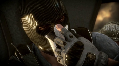
*Reading up on the history of game and developer* Says here on Wikies that EA (or Visceral)  Montreal, is, shut down... Well, that's sounds like a great time to be had. I just don't want to think of why it happened. I feel that their lack of game sales may have contributed to this developer falling in shambles, but my ignorance finds bliss. Other than Army of Two, most of their games seem like ports are or just small spin-offs of big franchises. I digress, this is about Army of Two; a series that I've heard of, played a demo for, and only 1 friend I have plays it. It always appeared as a fun co-op game, but I never got real into it. After a bit of thought, I can say that these games have a realistic action movie (if at all possible) sense to them. For one, gameplay concept of "Aggro" or, basically, one person shooting or exposing themselves to the enemy will draw their attention towards the corresponding player, really possessed a form of realism that most games then (2008) did not have. Unfortunately, I never felt purchasing one as being necessary for my gaming experience. I wonder if this game will change that? It didn't help, that's for sure.


It's Not Halloween! Why the Masks?

I wanted a title to fit the visual and artistic presentation of the game, there...

The music in this game is worth just as much as music in a Gears game, it's just for background and nothing more and else. It's not terrible music, it's just decent enough to have no complaints and deduction to reserve. I feel that sound effects should be noted though. The metal parts flying everywhere and explosions going off really set a sort of realism in this action movie world. The guns sound like COD guns, but the sound effects are over all great, but okay with music. Now, for how the game appears.

The previous two Army of Two games used the more so typical Unreal 3 engine, which at the time(s) looked pretty decent, but not great. This time, Army of Two utilizes Dice's Frostbite 2 engine  Okay, wow what a switch. For that, it's quite a pleasing for this game to run. Physics look very natural and clean, with some well rendered worlds and models. When the game is first launched, the offers an HD texture pack install; playing with it off and then on, I have to say that does not look a.. whole... lot different. At least I mention that for fabric texturing quality, it burray! From a third person distance, it appears tolerable and that's all to say. The guns and masks look new and shinny. Speaking of Masks, would this be an adequate place to mention customized masks? You can make a customized mask! It may have doable before forgive me for lack of knowing. Sadly, it is not as good as Call of Duty emblem editor, but it's cool to make your own mask or attempt to make a Slipknot looking one. On to the characters behind the masks!


Paper Loses to Rock, yep...

Seeing as there are always just two main characters, making them likable is pretty much key to even a remotely decent game. At first, a really wondered why we didn't play as Rios and Salem, but that will come soon, get ready for the worst of that. For the characters you do play as, Alpha and Bravo; they start off pretty mindless, but soon their personalities come through. Unfortunately,  Rios and Salem seem a bit stale, but once in a rare while they will crack or just apart of a joke made by Alpha or Bravo. Theirs names are another interesting point, they never tell you them. I really don't understand why; is it trying to make it feel as though the gamer is one of them? Well, that just does not work in this day and age. The only way to do that is have custom facial features and being able to name the first name. Been done very well many times before, if you don't do it to the "n-th" degree, just don't even try. The characters are adequate, to mildly put.

Now for the story. There is no way for me tell my opinion about this without giving away the biggest spoiler, I will put the spoilers around quotes. You are not prepared: So, we start off in training with A&B (Alpha/Bravo) not so hard. Now it gets confusing and from I gathered you are going to rescue this person and there is this cartel that attack you and then see the main bad guy and then you fight in and out. Salem grabs a car and you drive until it flips over and Salem gets trapped under neath. Then Rios tries to get him out, but the cars explodes with him inside, a he dies...

[SPOILERS AHEAD]

"but he doesn't and no body knows. Years later we find a mayor wants to put and end to this drug cartel's reign. So then after a few levels you meet that same person you saved and she wants to destroy the cartel for kidnapping her, oh how convenient. You find out that a guy who also wears a mask works for the cartel. Later you find out it is Salem and he is disgruntled that you left him to die when he clearly was dead. Five reasons this makes no sense: 1. You don't survive with a few burns after a car explodes from the inside. 2. The cartel would kill him instantly. 3. If he did survive, he should have known what kind of jobs he did for years. 4. Apparently he does not care about his friend Rios whose has saved his life and all the other crap they've been through, like starting up TIIIO. 5. He's a bitch. Cry me a river. Right at the very end, Salem scratches the name of either Rios' girlfriend or sister on the wall of his prison cell, that is no April Fools"

I'm done, I'm SO DONE! It is that horrifically bad, I mean it's the most asinine storyline I've ever experienced in my life of playing video games. It makes no sense, has no point, and has a "The Departed' ending, but with a little more bullspit at the end. Other than the barely revealing characters, the storyline is a typical destroy the drug cartel, and that the thing with Salem kills the entire thing. Did M. Night Shyamalan write this piece of crap? It's, it's bad, not so bad, good, but so bad, bad. This game has the one of the worst storylines in modern game history, period. Oh yeah, it's ending is pretty much 10 times worse than Mass Effect 3, if you hated that ending. Overall, this is, *long sigh* moving on...


I Declare A Thumb War

The gameplay is actually very delightful. There. Is that enough? Of course not, the storyline only beats it half to death. The gameplay feel is very clean and smooth, with a very nicely made, fluid cover/movement system. When being ostracized, such as myself and are playing solo, the partner AI, is pretty smart to the apex that he can actually kill multiple enemies and 90% of the time actually revives the player in reliable time. That's if your aren't stupid and run out in the field to just get mowed down. In the final room of the game, the AI goes full-on mentally challenged by straying away from you and walking around aimlessly. The final boss is much easier if he is kinda of helpful, but that happens on and off. The games also has a good length to it with a total of 50 "level segments" that run a pretty decent amount of time, about 10-20 minutes to complete each one. It's also made for some great chaotic co-op fun. I did encounter 4 very similar bugs that just kept the level from progressing, but can be fixed by restarting the checkpoint. The game also has some really easy to challenging difficulty levels that take some tactical thought to finish. I'm not done yet, just a bit more.


Co-op Customization

In Army of Two: The Devil's Cartel, I didn't know you could customize weapons until an hour after playing, I should have looked a bit harder. You can! I really enjoyed this feature, it was cool to "Call of Duty" or "Ghost Recon" personalize your weapon for a third person co-op game. It really lets the two players stand out from one and other, which in turn, let's them fight over who's cooler than the other. Probably should have put the custom Mask creation thing here, oh well, it's up by the art style portion of this review. The game also features a leveling system, in which after two playthroughs, will get you the highest rank of level 25. Good news is there is no tacked on multiplayer and co-op is very enjoyable. You can also earn money that can be used to purchase a small abundance of Weapons (and attachments/camos), Outfits, and Masks. The money also progresses leveling up and acts as an arcade-like scoring system, which is pretty neat considering most games have points and an a game economy separately. That may seem like a lazy way to implement, but I find it fresh to see. The overall gameplay is fun and energizing, but really can't fully save this game. On the other hand, the gameplay alone may be enough to have a go at this game.


It Takes Two...

...too really enjoy this game, if you can get past the annoyingly terrible and bland storyline. The look of the Frostbite 2 engine is decent, even with the texture pack, feels natural. The music is what you'd expect and not so bad. The story... *uhck*, is not good to say without freaking out about it. The gameplay is intense and gripping. This game is an alright single player game and a prefect buddy game to play. Worth to me about 30 bucks, seriously, they might as well have no story. To continue, the gameplay is by far the best aspect of this game and is actually quite enjoyable. If you like shooters and don't care about storylines, and you have a buddy to play with or online "social skills", give it a rent and see this shi-I mean alright action game is a consideration for purchase. *cough* torrent *cough, cough* Army of Two: The Devil's Cartel, is the worst game I've reviewed so far and it did not have to be, it earns 3 eggs out of 6. This was not an April Fools joke.


Sunday, March 24, 2013

Another COG in the Gear of War Judgment Review


2011 - present...

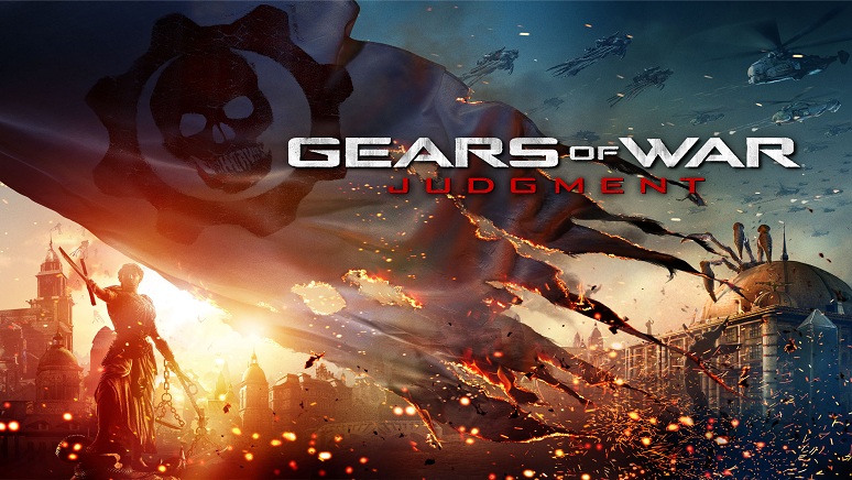
A while back, another Gears of War game was said be in development. I knew right then after my completion of Gears of War 3, what that statement meant, one or more prequels. It seems that prequels are all the rage lately in the seventh generation of gaming. So now, here we have Gears of War Judgment; that is a suspicious title to say the least. It is interesting to note that Cliff Bleszinski did not even touch this game, period. Well, he might have played it, but he still had no hand in the actual development. Now I know what you're thinking, don't jump too far ahead now, the rest of the developers at 'People Can Fly' got a year and half to create this game. I can now take it off the shelf (from the video rental store) and examine this compact duel layer DVD newly born in the Gears of War family. Here I will let you know if this game is just another COG in the Gears of Microsoft's money machine or if it can stand in with a bloody good game series.


...And Justice For All

Gears of War Judgment is a prequel to the original game and surrounds the characters Baird, Cole, and two new character's: Sofia Hendrik and Garron Paduk. The main levels of the game are the squad member's flashbacks that serve as testimonies during a military tribunal. Each member tells a different part of the story, when they traveled to a COG base and launched a lightmass missile without authorization and now face execution. That's our Baird! I find the storytelling and narrative in this flashback format to be quite unseasoned for a game like Gears, and it's a nice tweak. I believe that most fans will still enjoy it just as much as the other titles. Once the story is completed, it's time to hit it up right before Gears 3, with a story extension called Aftermath. It takes place just moments before the Imulsion cure is released. Basically, before heading to Azura, Baird, Cole, and Clayton Carmine attempt to find a transport and reinforcements. I don't want to give it away, too much, but Aftermath follows a more traditional narrative path of a Gears game. The standard story almost felt more akin to a sci-fi noir game like Halo 3: ODST, and I will come back to that game. Each character has a different chapter to tell and investigate.

The characters the player jumps into correspond with each individual testimony and different area of the game. It was neat to witness the different character's perspective and ongoing, changing attitudes towards the other members, their mission, and the war as a whole. At first, I only appreciated Baird and Cole because we've had the three games to get to know them. Most would like Paduk just because of Russian-like voice and stereotypical attitude. With time, just a little time, I figured out his background and could sympathize with his motives, but still could argue with a few things he says. Unfortunately, Sofia didn't really hit it off with me at all. She seemed like a detached character, that annoyingly does it all "by the books". By the end of Aftermath though, I finally felt for her, but it took a while. Gears of War Judgment follows our two favorite characters into battle and does a favorable job of developing some new ones to tag along.


Blackened

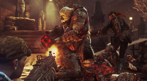
The visual style and graphics of the Gears games hasn't really open eyes very wide, but it did progressively get better and better. One look at the title screen and you'll know if the game's graphics and style will do justice for a current generation. The graphics in this game are of the best and even slightly better than Gears 3. Every location looks so freshly abandoned and demolished, it looks great. As you can see, fire is pretty much everywhere in this game, and it looks really bright and awesome. The reflective and shine effects look quite gorgeous and I did find myself looking at the scenery quite a lot. It is, by far, the best in the series. The cut scene graphics however look exactly the same as the third game, but to improve that takes some more time and money. I have seen the skeleton and the basics of the UDK 3 engine and I have to say, this engine is about as good as it's going to get and looks great for being almost 9 years old. As you can also tell, I based the title of the paragraphs off of a Metallica's ...And Justice For All tracks. The Judicial statue in this game reminds me of that album cover. I know that figure was designed much earlier, but the dark tone of both works fit considerably well with each other. Speaking of music, the soundtrack of this game sounds like a rehashed version of the Gears 3 music. Music in these games is just for background noise, nothing great. The graphics and art style of Judgment are improved a tad bit and still looks great for an aging game engine.


The Shortest Straw

The gameplay of Judgment is not any different or fresh in any way: It's Gears 3 in a different environment basically. It has its ups and downs, I feel like each battle encounter is just a, "Here we go again...". Compared to the other games, it's the same old tired thing. I will give some credit though for the implementation of the star ratings, Horde-like battles and Declassified missions. The star rating system really adds to the replay-ability and challenge of the game, much like in the recently released Metal Gear Revegeance, but not as fun and intense to go for. The Declassified Missions just alter the current mission to a certain criteria for a change of pace, and eh I did them because of Achievements. I did like the Horde sequences, but soon after, they get tiring and aggravating to go through. I will say, this was just what it needed to get this game off the ground, for a little while at least. The campaign has a decent length to it, but when it's done, there isn't much of a motivation to play it again. The gameplay of Gears of War Judgment is the same thing with just a few interesting things joined in.


One

Well, maybe a bit more than just one or it's not multiplayer. Many games rushed out this past month have had their share of tacked-on multiplayer. Gears of War games have always been created with multiplayer in mind and it has never felt tacked-on. Judgment tries to take its word up on that, but falls just short of the fun the previous games contained. Some players are just going to be so much better than most and it gets annoying, but that's dedication and that gives it some good. Gears fans will enjoy it more than casual players such as myself will. In Team Deathmatch, it is a who is better contest and same with Free For All. I will say, that Domination is quite enjoyable for a while and it actually keeps the team doing something unlike many others multiplayer now. The game has also gotten rid of active, reloading, DBNO, and executions. Why? I do not understand this decision at all, that was fun to do. They also got rid of the Locust team and now the sawed-off is two shot and weaker now. I really cannot comprehend this and it seemed like a lazy attempt to change the game. Not a good thing.

In addition, there are only four maps and despite how well designed each are, we could have had at least a couple old ones chucked in for some more content. The controls have also been more streamlined with the left bumper being the grenade button and Y being the weapon swap. A good modification, but this takes away the ability to plant grenades and support and third side arm weapon. Okay, it's not all bad. The game type Overrun is a whole lot of fun to be had. You can play as the Locust and kill the COG or be the COG fending off the Locust. It's a entertaining mix of Horde and Beast with a Battlefield-like objective and progression. It needs to be played to be understood and appreciated, it's very good to say the least. Go and try the demo to see my point. Survival is the last mode and it's just Overrun with AI, so... that's it. Still not happy? In due time, the game will get the addition of the Execution mode and couple maps for free. That's great news, I feel this game is lacking a bit of content, but at least the game works properly.


Harvester of Sorrow

RANT TIME: That gun... This really got to me. You had to pre-order this game to obtain the Classic Hammerburst from the first Gears game. Oh and it's not the same gun, it's a burst fire. I know what some may think, "Oh it won't affect the balance". Do some forum surfing, you'll find that people really think this gun is really good. They make you pre-order or soon possibly purchase the weapon from the Xbox live Marketplace, to get the advantage. I feel the blame of this falls squarely on Microsoft Game Studio, and potential feeling that this game would be terrible. Then they make you get stuck with the game not knowing if it is good or not if you want the gun. Buying optional things that are for aesthetic purposes is alright, but they went way too far this time. This is worse than the micro transactions the EA has now. There is even less items to unlock in this game, but they do give you prize boxes from completing certain goals, but most of those are just XP awards. So much more content could have put into this game. Microsoft, wake up and give everyone that gun! Don't be like EA!


Eye Of The Beholder

Gears of War wasn't done yet, and I knew its next direction. I bet many others predicted something along those lines too, and it's not disappointing, to some. The narrative was very intriguing and neat to follow as a first approach in a Gears game. The characters we knew where great, and other characters where what they could be, nothing more. The graphics don't change a whole lot, but still appear as well they can on and old engine. The visual style is unchanged, but is alluring enough to take a second glance at the scenery. Neither aspect is grand or even memorable for any of these games. The gameplay is identical to the other games, but adds infrequent changes in play. These, more so additions, give a little more, but get tiresome after some time. The multiplayer shallowly deletes some fun features and has only two fun game modes: Domination and Overrun. In all, the game feels less, in terms of content while comparing it to Gears 3. I think of this game like Halo 3: ODST. It should have been called Gears 3: Judgment and priced at around 45-50 dollars. It's for the huge Gears fans, not anyone else. For a causal player like me, if you want it enough, wait for the price to go down for your own good and bite through being murdered by the Classic Hammerburst. It is not worth 60 bucks. Gears of War Judgment is just another polished COG in the wheel, it stands in the corner of the series at 4 lukewarm eggs out 6.


Friday, February 22, 2013

Cut and Take this Metal Gear Rising: Revengeance Review


The Rise

Metal Gear Rising was first hinted after the release of Metal Gear Solid 4. It was originally meant to be a interquel that showed Raiden's transformation between MGS2 and MGS4. It was finally announced at the Xbox conference at E3 in 2010, but later was "quietly" cancelled because Kojima Productions could not successfully design this particularly new "cut at will" gameplay mechanic. They did however, fully develop the stories and in-game scenarios. Kojima later met up with a producer of Platinum Games and requested them to work on it. The new current version was then revealed with an actual trailer. After development began, they discarded stealth as a main element and included high speed hack and slash. They stating the original game as being very "dull",  much unlike the High Frequency Blade weapon. Metal Gear Rising: Revengeance became the Lighting Bolt Action game we see now.

Enough of the history, Metal Gear Rising is not Metal Gear Solid, it's a spin off time. The gameplay, as we all know, is a huge leap away from the stealth Metal Gear is known for. No more emphasis on guns and silence, rather now it's sword play and slicing. Speed and reflex is key now, not slow and steady. Metal Gear Rising: Revengeance may create a great spin off a successful different gameplay of the ninja we saw first as a kid that has been through the worst imaginable. It could also unfortunately be another stereotyped sub-par Japanese video game. Let me, take a slice at this reviewing thing.


Realistic vs Pretty

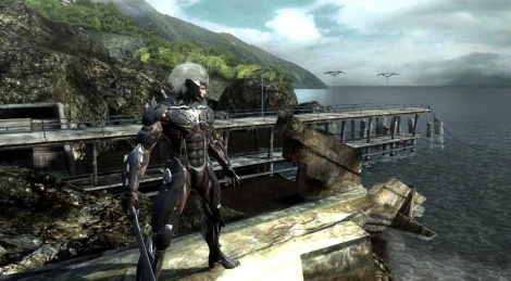
Many early gameplay demos of Revegeance showed the world as being very clear and colorful. The current game looks nice, but many of the levels at the beginning of the game have a very brown and grey tone to them, with little more vibrance as the game progresses. The environment does break into some neat looking scenery, but it's not gorgeous. It's more realistic than pretty, but is that bad thing? Standing from the slightly lower end Xbox 360 console perspective, the rendered characters and cut scenes look very nice, seeing as how they are at least half the game. Hey it's Metal Gear, it has it's large emphasis on story, which will be discussed soon. Most of the objects in this game are "slice-able" and when you deiced to just start slicing everything up like lettuce, you'll know how cool it looks. All of those sliced objects will disappear quite fast, but I can understand with this generation of consoles. You cut into an object enough, the game starts to lag a bit. Along with just cutting the world up, this game sure is violent! Not as much as Prototype, but even slicing up these red blooded cyborgs gets a little gruesome, but oh so satisfying. Lastly, all of the city environments seem to be magically empty except three hostages during the entire game. At two points in the game, the characters mention an evacuation, but the cities just seem too dead and not very modern. Overall, Metal Gear Rising visually appears alright, not as good as I wanted to think.

Metal Gear Solid always have some grand beautiful and hectic musical scores. Metal Gear Rising also takes a leap in terms of this, to more of making it sound like some bad copyrighted music that was made for a game. The music sounds exactly like the rising in popularity, metalcore music. I mean, I love metal, but I am not a fan of that kind of metal. Although the instrumentals are really decent, I really wish the vocals could be turned off. I feel that lyrical music fits best with driving games and shooting games or just at the credits. I will say, it is good for this game to have fast chaotic music, but oust with the vocals please.


Stories from Kabuki Theater


Now don't quote me on this, but I've read that Metal Gear-ish games had a large influence from Japanese Kabuki theater. That must be why the Metal Gear games have always felt a little odd with the characters. It could also just be influence from Japanese Anime. I do love this series, but I am not into the Anime stuff at all. Metal Gear Rising is no different in this aspect. Some of the actual American characters act, let's say more realistically American than others. An American senator acts like a Sumo, fat Yakuza boss. An American senator, from Colorado! Many of antagonistic characters like to do the point and then dramatically clench their fist action. To put it plainly, all the enemy characters act ridiculous and way over-the-top. I wont criticize that, but I will take into account the addition of a lot of profanity. I am in no way adverted to it, but it is just so out of place. If characters act ridiculous and start swearing, it makes their madness seem so fake. It only works for Raiden who has been through the worst in life and does not act so insane, until his "Jack the Ripper" persona emerges. Even in that act, the profanity is still feels more in place. Over the top characters, even more so than the Metal Gear other games.

As for the story line, it is sub-par at the least. The main concept is about Raiden trying to prevent this corporation that is taking 3rd world children's brains and training in advanced VR to become super genocidal cyborgs. These brains would be trained to kill and cause war to break out, reviving the dead war economy from the previous game. It's about cyborg bodies, there, see, it's a little out there. The one thing this story does do well, is it vividly keeps you interest even though the ridiculous characters are present. Metal Gear Rising even makes references to Raiden's past along with many tongue-in-check recalls of the main series. The game still contains the codec sequences that drag on a bit, but most of the characters do have something interesting to say both for the game and even our our reality, how interpreted is up to the player. Metal Gear Rising has decent writing, with over dramatic characters, but it manages to make you think about the real world. Metal Gear games have always been very aware and smart in philosophical ways. This game does another, okay job in terms of narrative.


Hard and Short... uh, the game...

The gameplay of Metal Gear Rising is not stealth, but more of a button mashy hack and slash. The general game feels like a mix of Devil May Cry and God Of War. For a Metal Gear game, it still contains very intense action sequences, but like times 10 more chaotic.  It also has... those... quick time events. Don't worry, they're present like any other hack and slash game, but not an overabundance. Unfortunately, there is still a sliver of stealth, and it just does not work at all. The game offers moments to be stealthy, but it asks for too much and when you fail, your punished. Also, there is no need for the alert counter either, it's unnecessary and detracting. There was no need to keep any amount of stealth you guys! Usually after the BRIING!, two larger enemies than the one you startled get called to kick your ass, which leads me to the difficultly. It's a hard game, it's really hard. It is almost impossible to not get hit during any fighting scene, not to mention boss battles. Okay, well to top that off, the game is about 8 hours in gameplay time, not counting the cut scenes. The challenge of the game is beatable, which is probably what the developers wanted to do to make the game's playablity last longer. It may sound bad, but for this game it works because it's just hard enough to want to get that 100% completion. For a short story, you will spend many hours on the full completion along with VR mission too. Timing and timing alone will keep you alive in this world. There is no forever blocking system like most games; rather a wait for the right parry to stirke. You cannot dodge, which is really bad seeing as not every enemy attack is blockable. It's hard, but oh so rewarding, especially to slice the enemies into a million pieces.


True Hack and Slash

That is correct! Even a Star Wars game has not been developed with the ability to cut almost anything down, apart, in the middle, and what have you. Now, to precisely cut anything, you need to go into what is called "Blade Mode", which is only available when your meter under the health is blue. You can then hold the mode down until the bar is empty. To coincide with the difficulty of this game, you can't just willy nilly hack every guy up you see. Most enemies take a number of hits in certain areas that will turn blue and allow the blade to cut through. When this mode is activated on a damaged or weak enemy, you can cut for a target that will allow Raiden to snatch the cyborg's energy source to regain full power. This is known as Zan-Datsu or "cut and take", as the game refer's to. Adding even more to this great risk and reward system are the challenging and blade wearying boss battles. One is based on speed, one can split off segments of his body to avoid your blade, and you just have to play it. The boss variety and challenge of your sword is really quite aggravating and, yet again so rewarding to beat. Here's another thing, you can save a whopping three different hostages, okay, yeah. They don't matter, you just get pitied for not saving them, WHOOPS! The game also has running system that is very much like in Mirrors Edge, called Ninja run. You can run with great speed and vault over any short object or obstacle, which adds to the intensity with exhilarating running sequences. The game also has a small upgrading system that will allow extension Raiden’s cyborg body and usage of boss weapons.  The overall gameplay is very fresh, very hard, and very rewarding. It is, by far, the strongest aspect of the game and saved it for me in so many ways... besides the length.


OH MY GAWD, MEDAL GEEEEEEEAAAAR!

Yeah, yeah it's an Egoraptor reference when you can't think of an original caption. Metal Gear Rising Revengeance is only part of Metal Gear by name and story, with only a touch of useless stealth. By it's self, it's a God of War action game with amazingly fresh and fun gameplay. It also has a bountiful amount of references and undertones with bizarre characters. Set in bland and not so realistic settings, this game keeps the interest through and past the game's entire story to warrant a replay. It is a very challenging game, but if you enjoy it enough and develop the motivation for major risk and reward, you will have many hours of the game to earn a 100% completion. If you want to try it, just get a 2 night rental, you'll beat it on easy for sure. If you want to feel good about defeating such a hard game like every other Metal Gear, you should buy it. I do suggest waiting for a price drop though. Everything about this game, except the side story interest and the gameplay, are just okay. It's Short, difficult, dramatic, frustrating, reflex stimulating and; however you cut the cake, it's earns a 4 and a half out of 6 eggs.